

old logo vs. new logo
The new logo was designed by Laird and Partners, Gap's mainstay creative directors. The change in the logo signifies the company's plan to evolve and change. Yet, this momentous alteration has been a pool of hatred to most retail consumers.
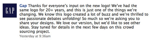
It was announced yesterday through Gap's Facebook Page that the new logo is here to stay, but they would definitely love what the consumers have to say or if new ideas (a.k.a. better logo) can pop out of society's mind.
Honestly, the new logo doesn't work for me. No serif means no hint of "style". It's too Arial/Helvetica, plus the blue gradient box is screaming "FINANCE!" and "BUSINESS!". If they don't change it pronto, they might go downhill! The logo reflects the brand so it better be good to the eyes of the credit card swipers and cash payers!
So, what say you??
I say SPARTA!!!!!
ReplyDeleteHey, they scrapped the new logo! YAY!
ReplyDeleteYAY! Yeah I just read about it. Hooray GAP!
ReplyDelete